Kino-Punk is a non-commercial, rebellious, and honest media outlet about movies. The team has grown up, and the rebranding was meant to reflect that.
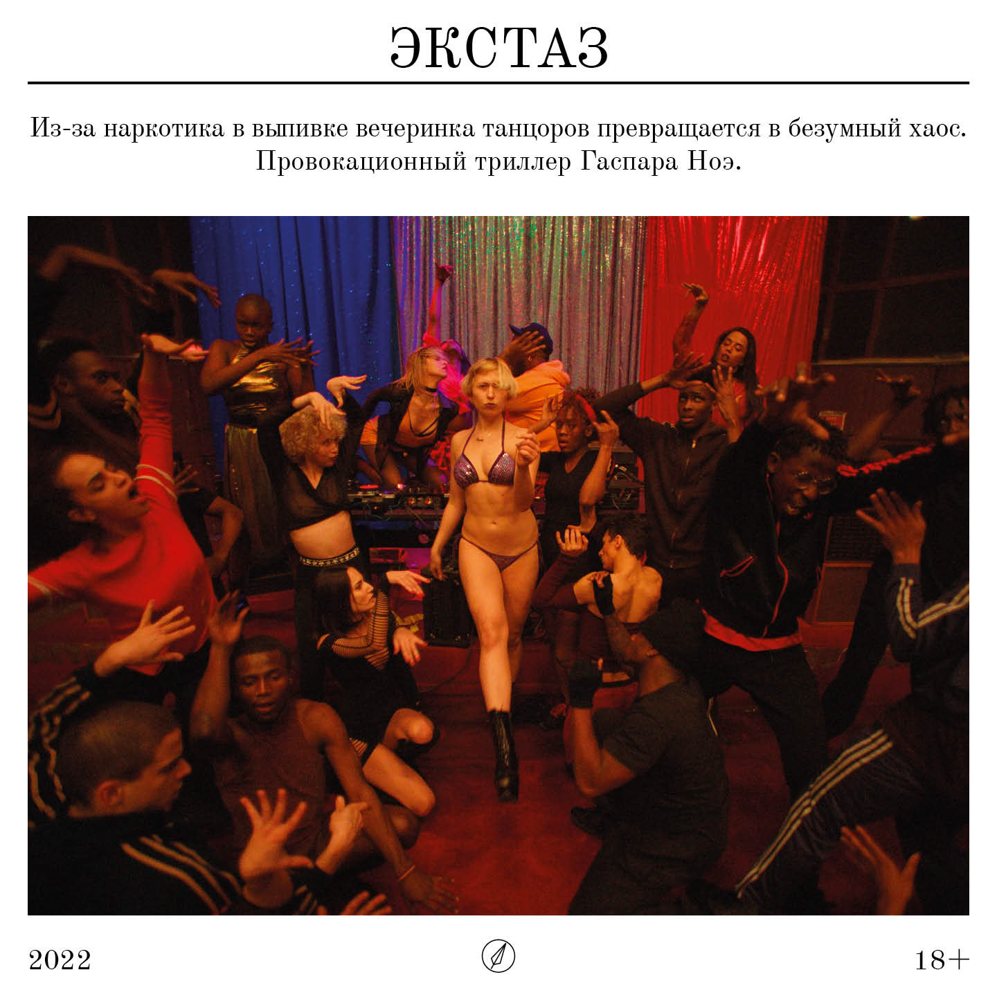
Style before the rebrand:
Style before the rebrand:

I asked the team and received very different answers. But here's what, it seemed to me, everyone agrees on:
"The publication helps to take a break from the loud headlines and information overload, creating an atmosphere of a literary salon without snobbery but with an extensive cultural background. It nudges the reader towards contemplation. We aim to shape and unite like-minded individuals for whom cinema is not just an amusement park ride but also a subtle, intellectual form of entertainment"
The decision was made to change the name to "Retsenzent" (The Reviewer), and initially, I wanted to define its main meanings for myself:
• the author of a review or critic;
• the literature journal that was published in the year 1821
Style of the 1820s-1830s:

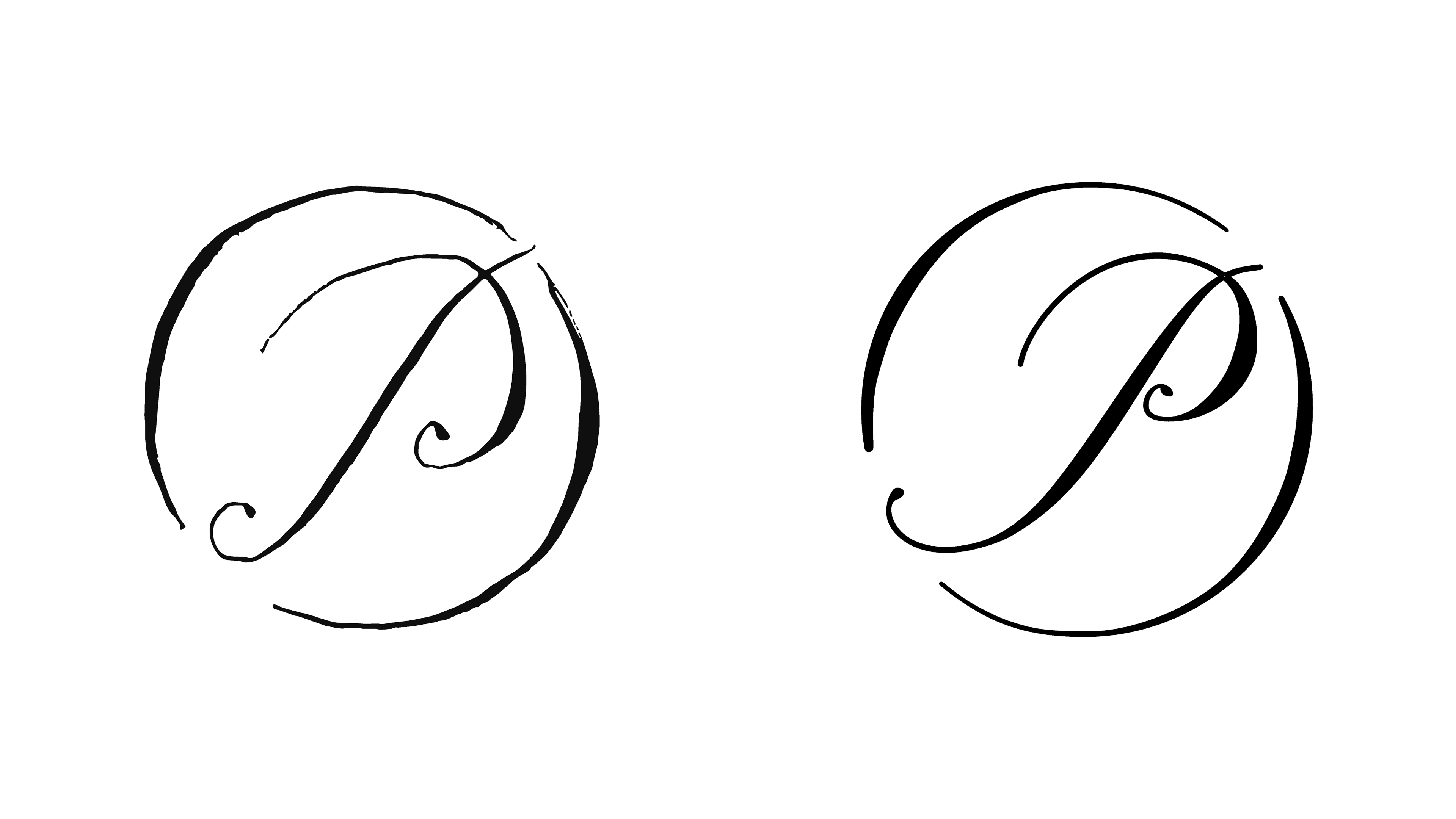
I found it interesting to incorporate as many vibes of a refined literary salon as possible, and for the first version of the logo, I used ink and pen in the style of copperplate, especially popular in the early 19th century:

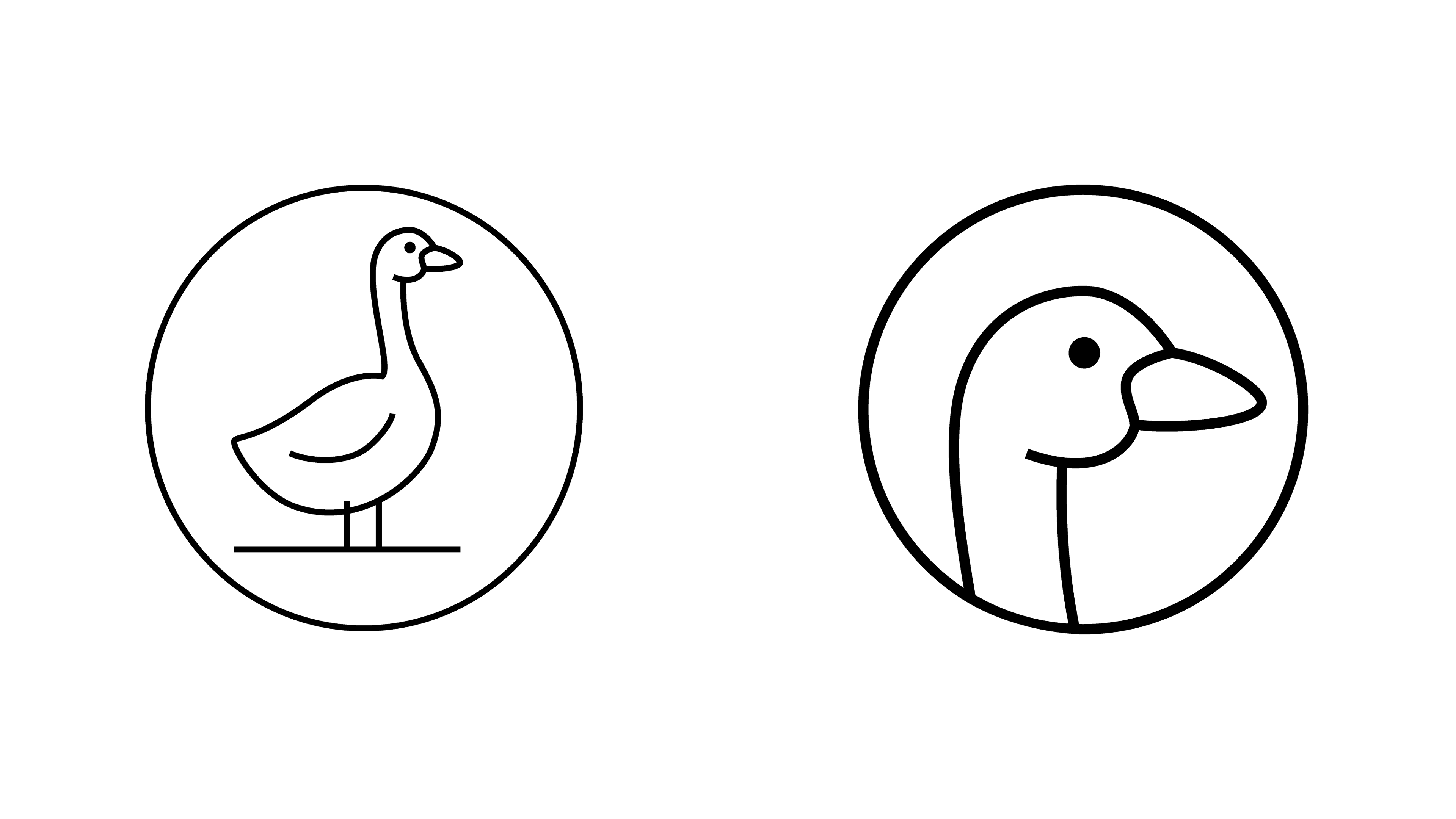
In the second version, I depicted the main tool of a respectable reviewer — a feather. Additionally, you can see an aerial kite, symbolizing freedom and independence:
(this one was ultimately chosen)

I also made a playful version of the main supplier of feathers in the 19th century. The goose was liked, so we decided, if possible, to incorporate it into the communication
For the text part of the logo, I chose Old Standard TT — vintage, free, and incredibly beautiful
Towards the end of the project, I realized that I absolutely dislike the quotation marks: they are round and don't match the chosen graphic symbol. Since the Open Font license allows it, I drew more fitting ones in spirit:

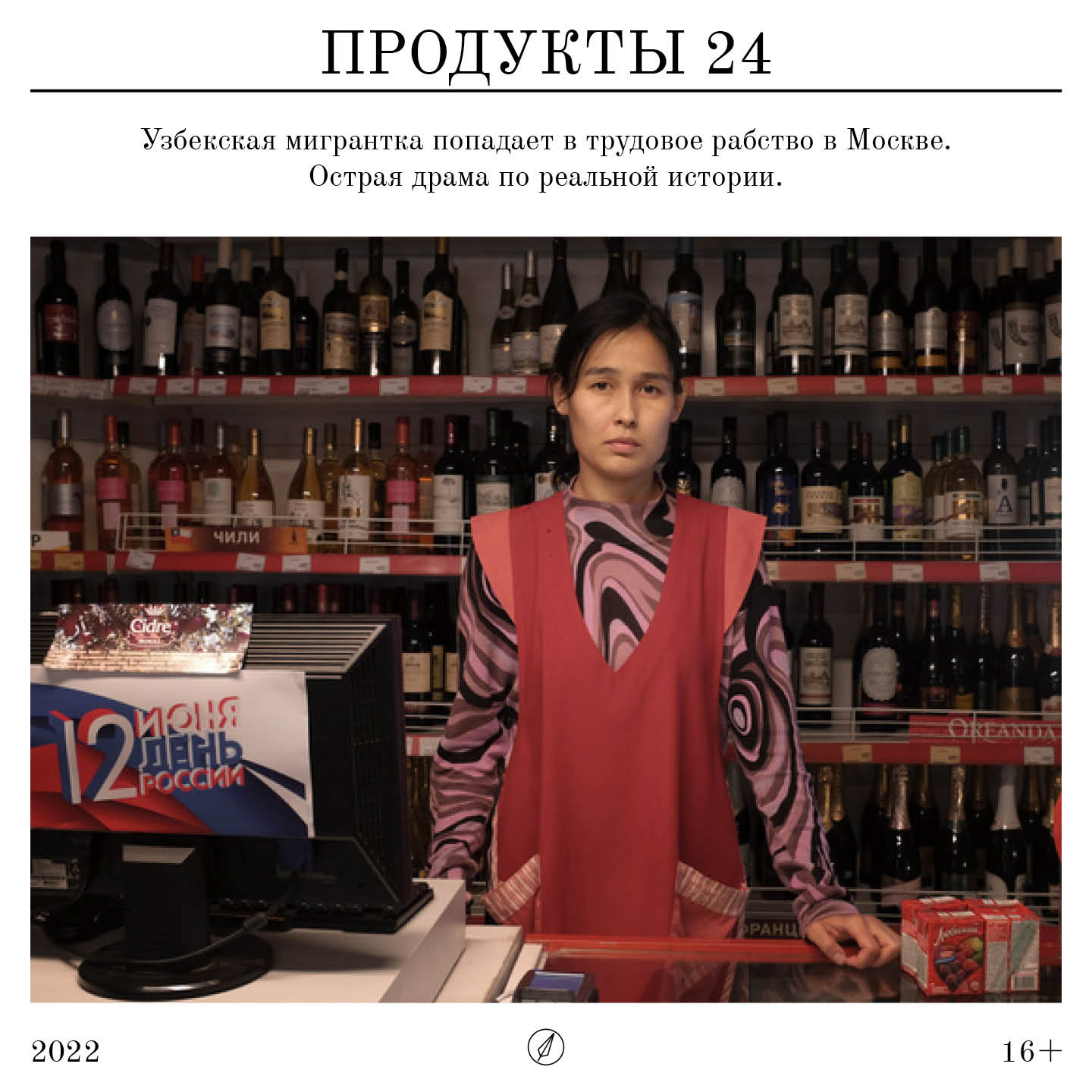
I decided to create a social media template with a hint of a newspaper spread, yet simple enough for the team to use without the help of a designer:

Also, as part of the rebranding, there were plans to update the website, and here I continued with a newspaper theme. I applied the brand color to the images and added 1% of sand to somewhat mimic the print effect. To avoid a completely somber look, I included color animation on hover"
It was decided to design the sections' pages as lists so that when choosing an article, one could easily skim through the titles. If necessary, you can expand the title of interest and preview it
So, I decided to design the pages with articles like this:

Also, there was a request to create a "Listen on Telegram" button, but I thought that few people would want to switch to Telegram just for a soundtrack. I decided to make a small animation with a goose that invades the page from the first seconds and asks you to follow the link. How can you refuse it?
Most of the website turned out quite restrained and serious, so I decided to go all out on the "Contact" page. After all, even though the magazine has grown up, it has remained simple and open
Ah, and if by chance you made a mistake in your site search query, the Reviewer Goose will kindly ask you to rephrase it differently