
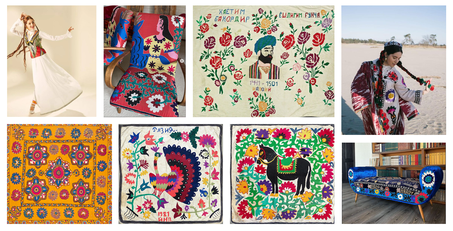
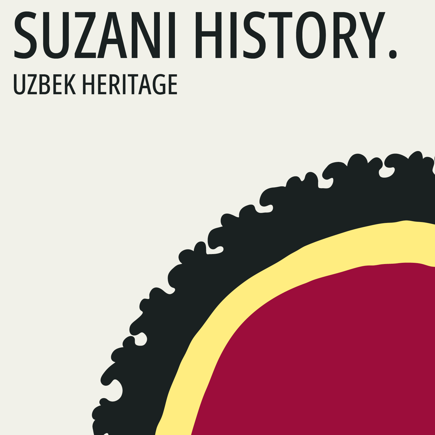
Last year, I was approached to create a logo for a local furniture brand that incorporates suzani into its designs. Suzani is a traditional Uzbek embroidery on textile panels, which can be used as decorative rugs, bedspreads, or tablecloths. Traditionally, suzani is passed down from generation to generation, gifted at weddings, and holds sacred significance in the cultural context of Uzbekistan.

To begin, I decided to define the key aspects that would form the foundation of the mini brand book:
Mission
To spread the unique beauty of Uzbek art around the world with respect for the planet.
Mission
To spread the unique beauty of Uzbek art around the world with respect for the planet.
Audience
Foreigners, designers, and art enthusiasts. People with a refined taste and a keen eye for detail, for whom every element matters.
Foreigners, designers, and art enthusiasts. People with a refined taste and a keen eye for detail, for whom every element matters.
How the Brand’s Mood is Perceived by its Owner
The energy of the East, the unique world of handmade craftsmanship, pride in supporting eco-friendly business, joy from the vibrant and golden hues of suzani, and surprise at seeing them used or presented in new formats.
The energy of the East, the unique world of handmade craftsmanship, pride in supporting eco-friendly business, joy from the vibrant and golden hues of suzani, and surprise at seeing them used or presented in new formats.
Brand Hero
Yulduz is a young and cheerful Uzbek girl with a bright talent. Modest, sensitive, graceful, joyful, and open-hearted.
Archetypes
The Innocent, The Creator.
Yulduz is a young and cheerful Uzbek girl with a bright talent. Modest, sensitive, graceful, joyful, and open-hearted.
Archetypes
The Innocent, The Creator.
Brand Formula
Eastern Energy + Unique Craftsmanship + Mindfulness
Moodboard
Eastern Energy + Unique Craftsmanship + Mindfulness
Moodboard
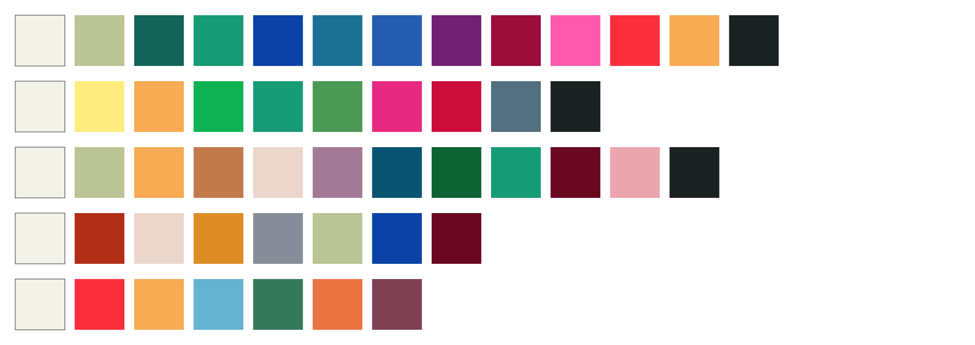
Colors
The brand colors are inspired by the hues of suzani. Instead of pure white and black, more natural and organic shades are preferred. All colors are conveniently organized into an AI palette file.
The brand colors are inspired by the hues of suzani. Instead of pure white and black, more natural and organic shades are preferred. All colors are conveniently organized into an AI palette file.
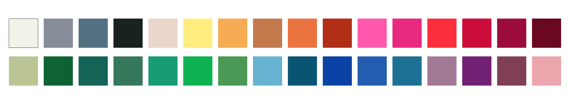
To maintain a clean and cohesive look, I arranged the colors into palettes that can be used for illustrations.
Logo
Given the richness of the suzani world, I decided to narrow the focus and draw inspiration from the name. Art Corner by Leyla tells us that Leyla is the creator of the pieces—associating the brand directly with her name or even her personality.
Given the richness of the suzani world, I decided to narrow the focus and draw inspiration from the name. Art Corner by Leyla tells us that Leyla is the creator of the pieces—associating the brand directly with her name or even her personality.
I discovered several meanings of the name Leyla: the first is "night, star, starry night," and the second is "lily."
Based on the brand’s archetypes, "The Innocent" and "The Creator," as well as its mood, I concluded that the logo should feel as handcrafted, uneven, slightly naive, and open as possible.
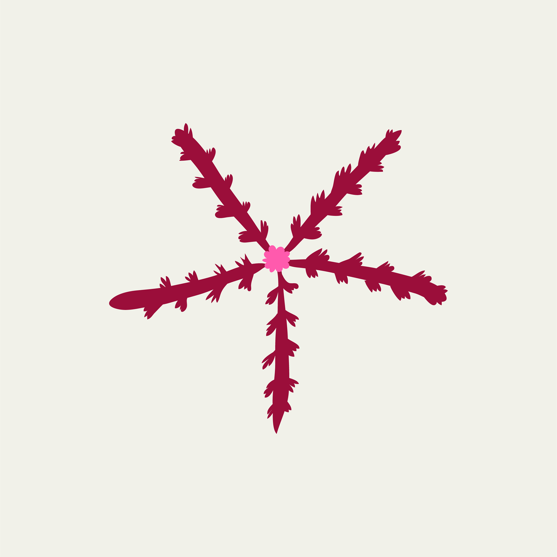
I borrowed imagery of the moon and stars from oy-palak patterns, as well as the lily. Moreover, I noticed that the shapes of stars and lilies are very similar.
Here’s how the logo exploration process looked:
Here’s how the logo exploration process looked:
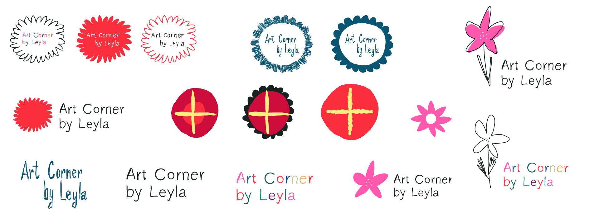
The client chose the moon design, which I refined further:
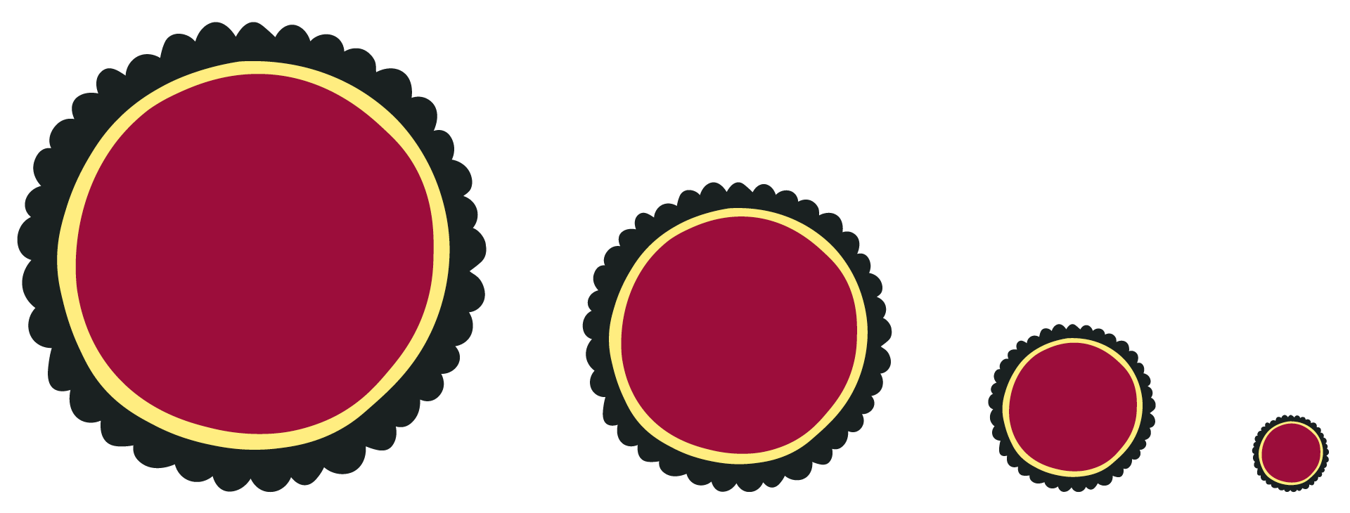
I also adjusted the typography, making the letters narrower while retaining a wide aperture:
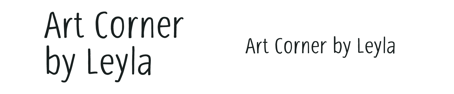
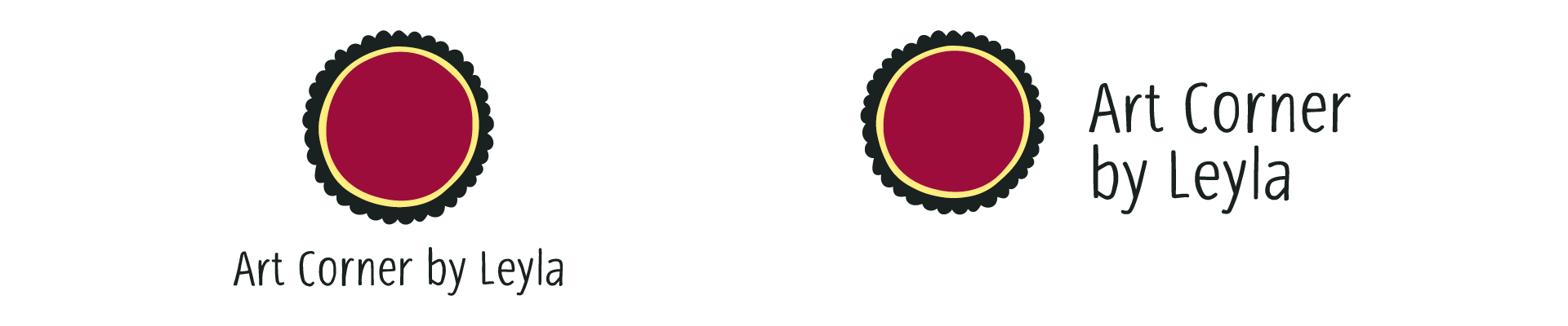
Here’s the final result:
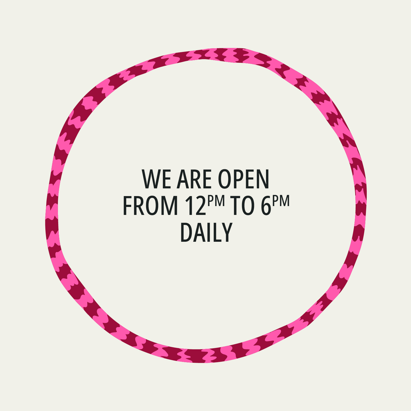
Social Media Posts, Posters, and Other Communications
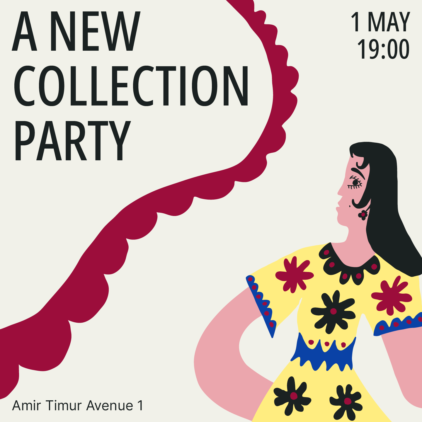
I proposed incorporating graphic elements of suzani into the design of social media posts and promotional materials:
I proposed incorporating graphic elements of suzani into the design of social media posts and promotional materials:
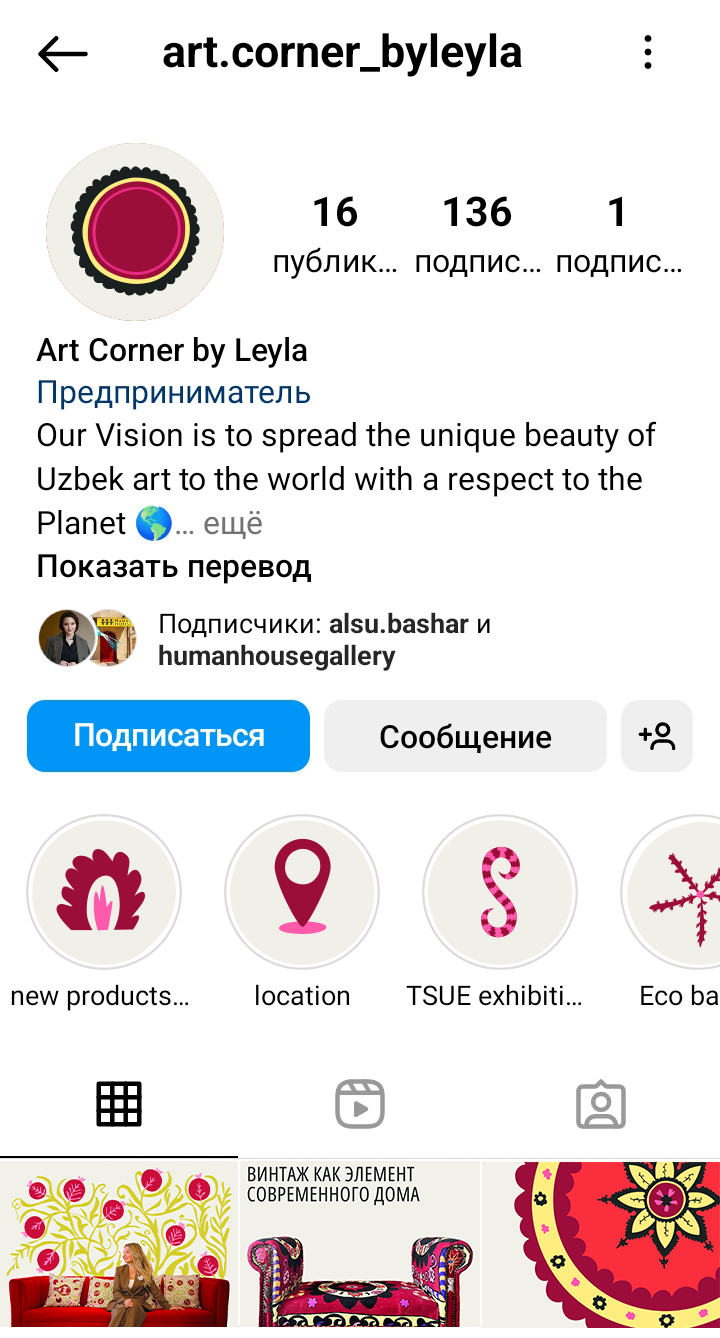
Social Media Icons
Icons are also designed as suzani elements and can be supplemented as needed:
Icons are also designed as suzani elements and can be supplemented as needed:

To order a visual identity design or discuss any other project, contact me on telegram