In our second collaboration with Hill magazine, I served not only as a designer, but also as an art director.
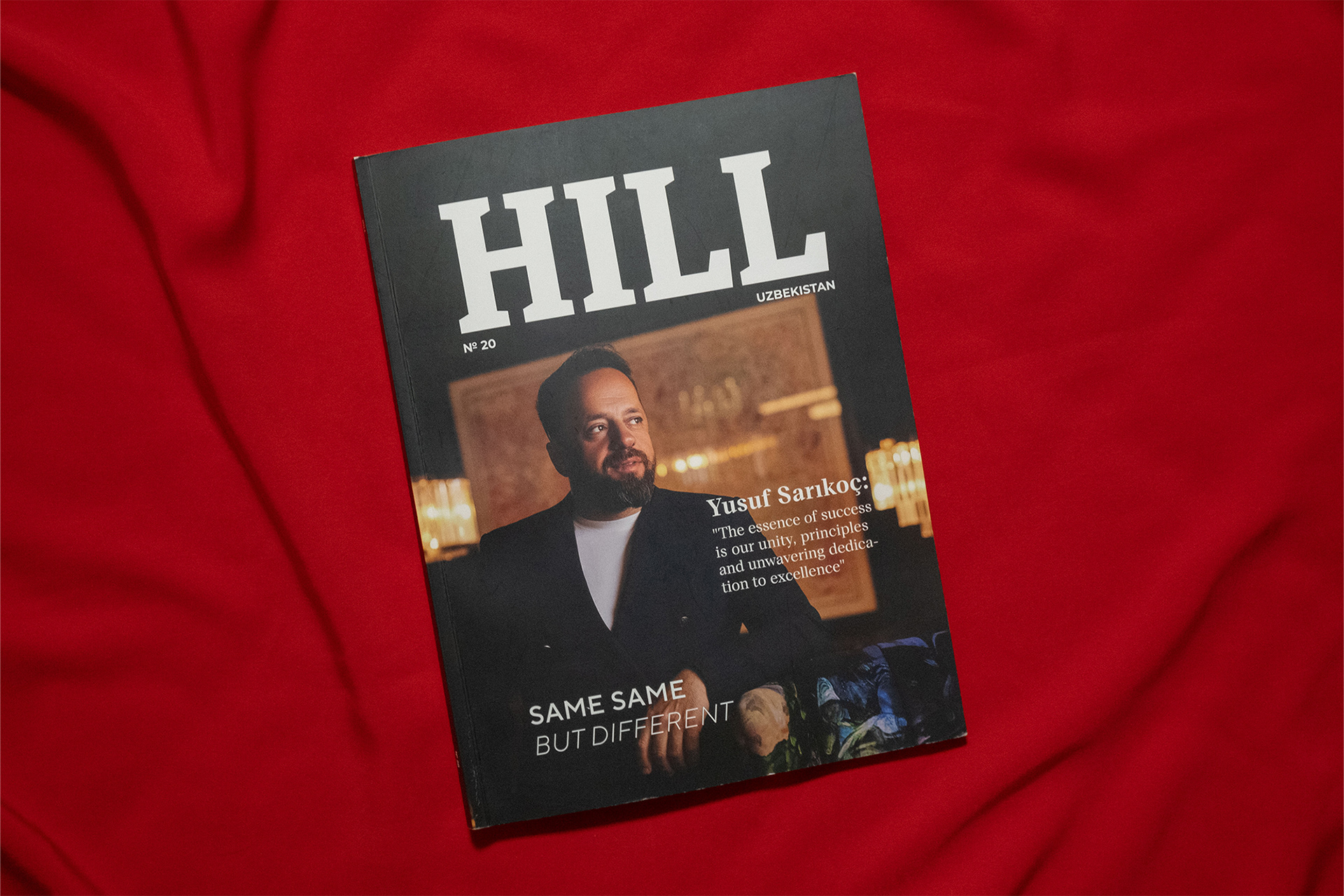
For the release of this issue, the brand had undergone changes — from a change in ownership to expanding its audience coverage, and now the magazine had to be in two languages. Since the glossy magazine is mostly about photography, the team decided to print one magazine, but it would be bilingual.
For the release of this issue, the brand had undergone changes — from a change in ownership to expanding its audience coverage, and now the magazine had to be in two languages. Since the glossy magazine is mostly about photography, the team decided to print one magazine, but it would be bilingual.


I tried to understand how they do this in the world, but I didn’t find any suitable examples, so I want to share how I did it, in case this example is useful to someone :)


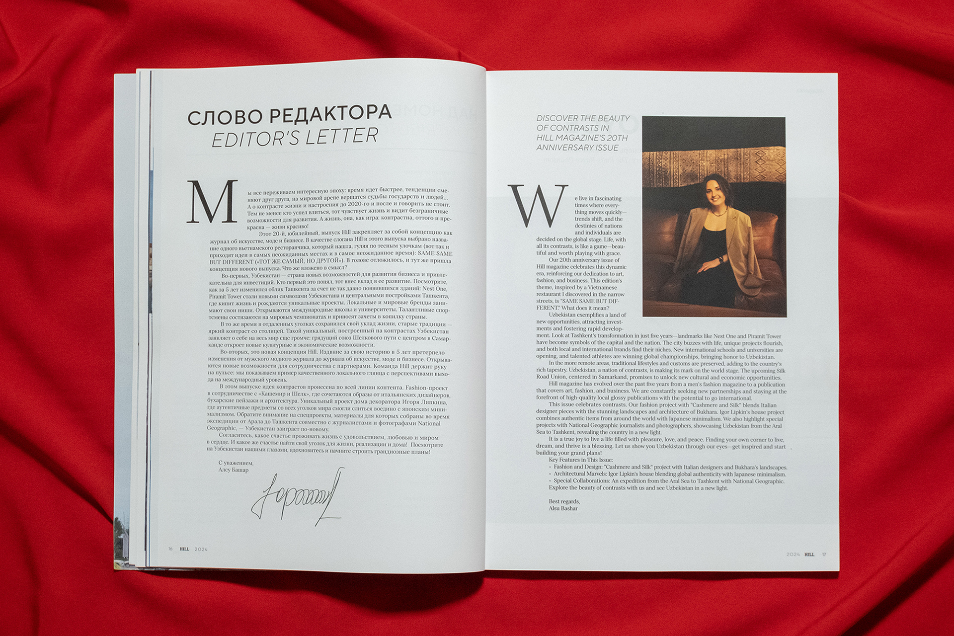
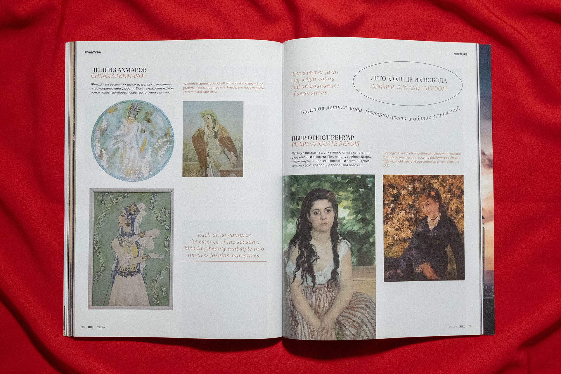
If everything is clear with books (one page in one language, the next one in another), then with such an abundance of photographs this is a bad option, so I chose two other methods for myself:
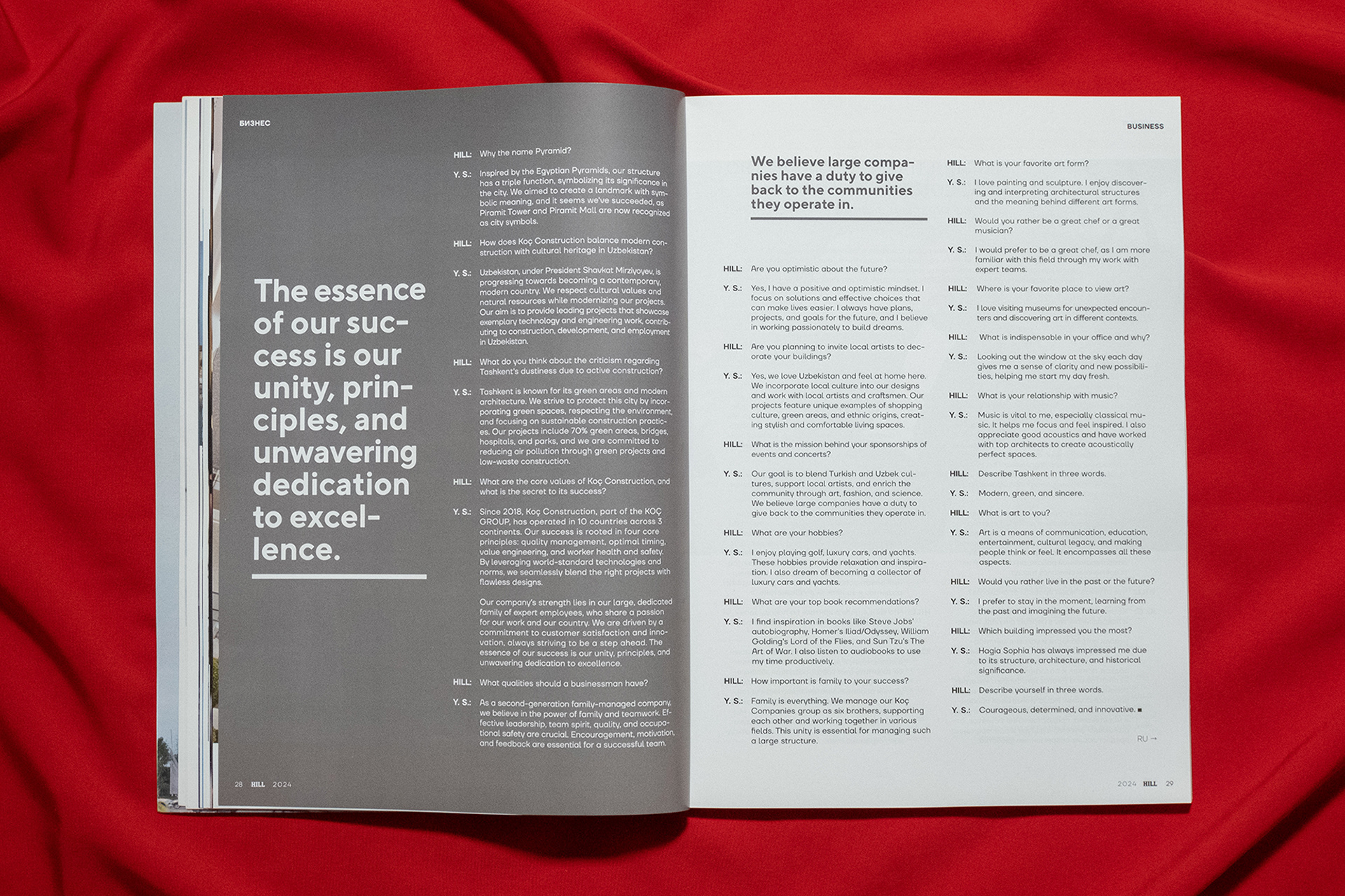
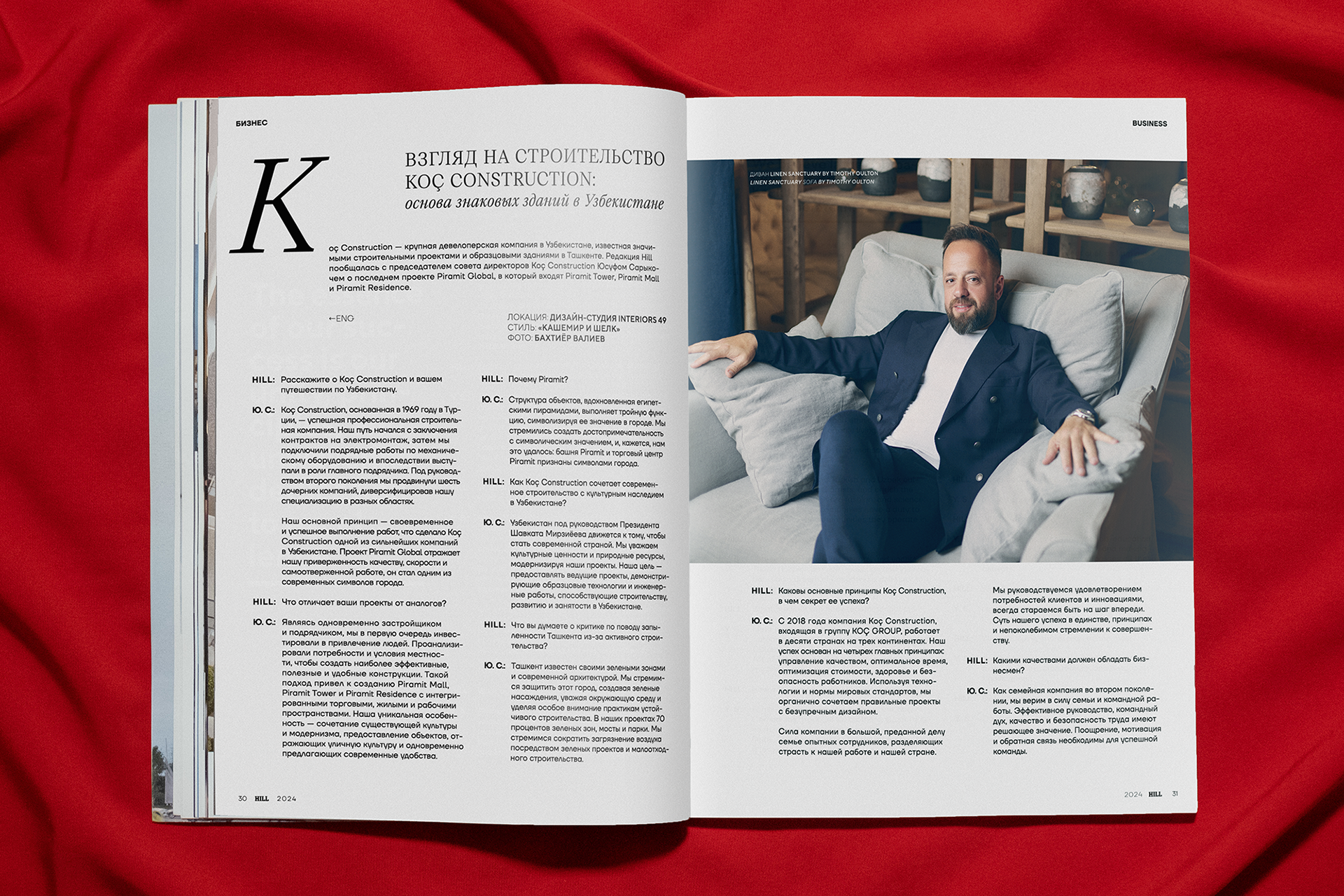
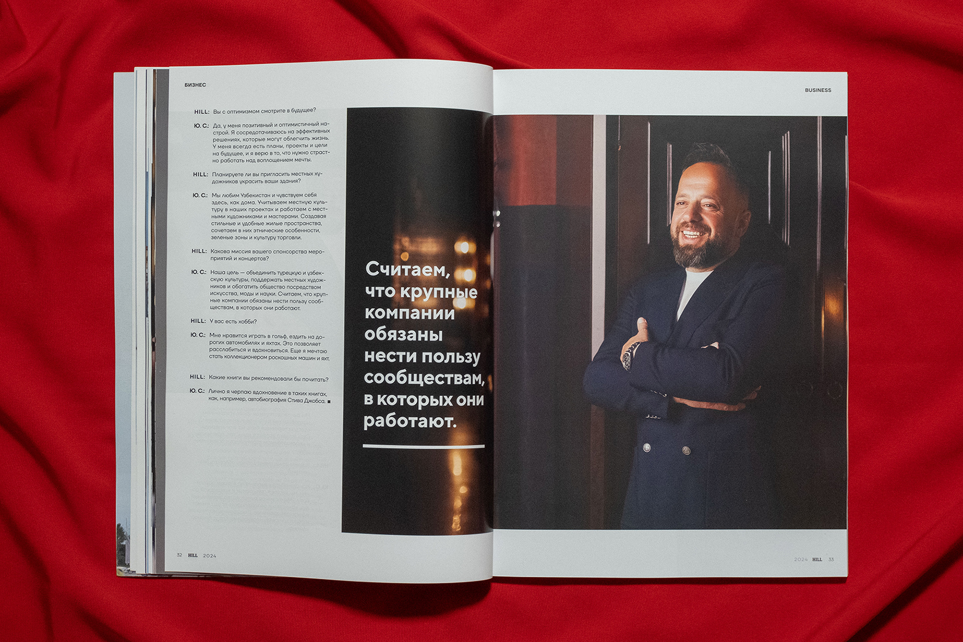
1) For large articles and interviews, I decided to layout the material first in the original language (usually Russian), then its translation (English). For convenience, I added navigation so that it would be clear that this material is in another language if a person suddenly opened the magazine for the first time. This method is super-convenient, because it gives absolute freedom in layout.

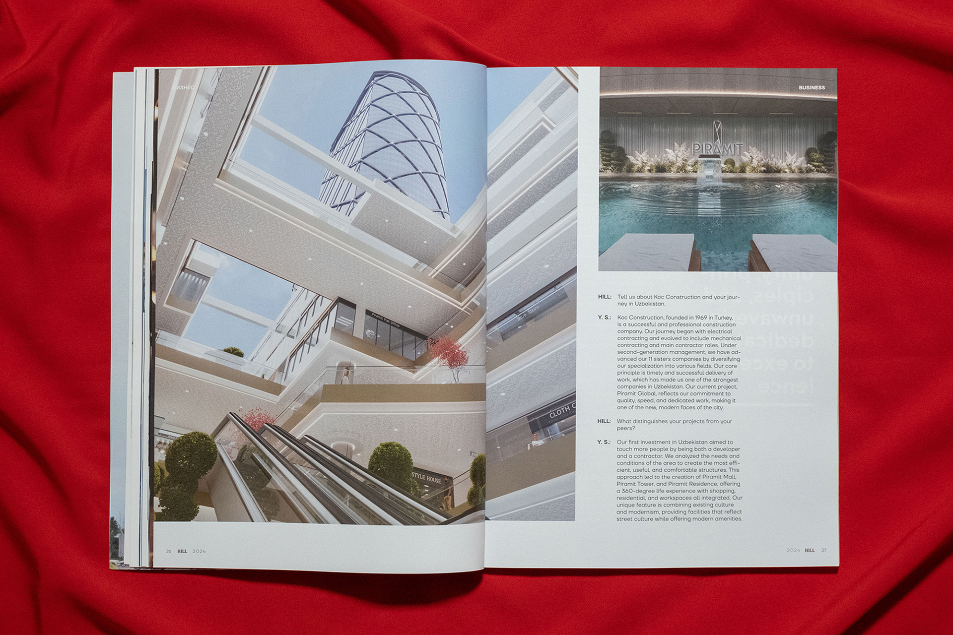
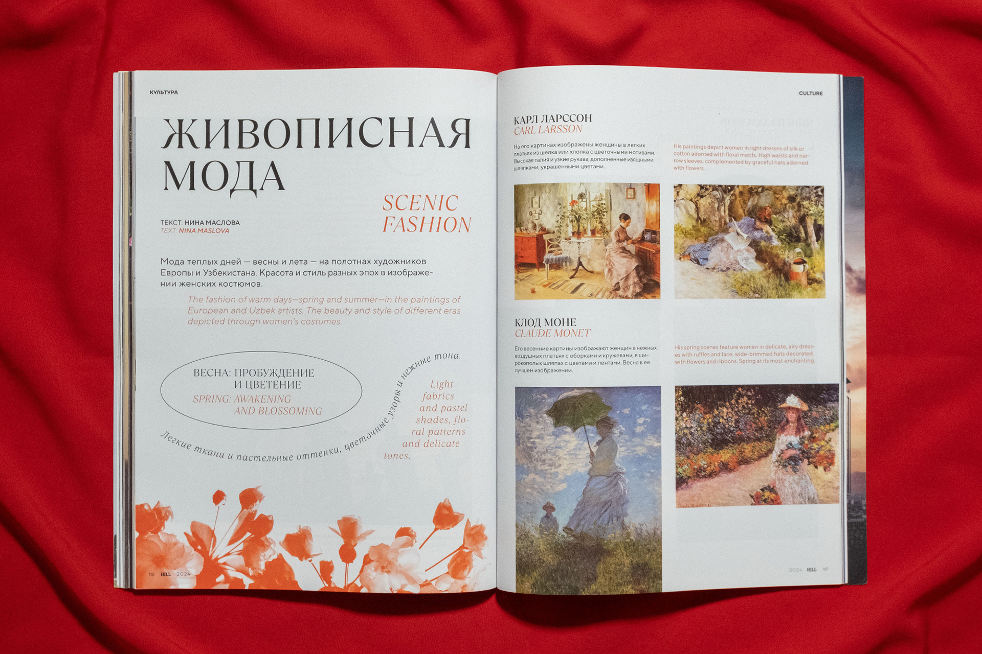
2) For material where there is not much text or these are some selections, I decided to duplicate the translation next to the original - this is convenient in conditions of a limited number of images and, in general, in my opinion, looks organic.

To order a magazine design or discuss any other project: telegram