Currently, active planning is underway in Uzbekistan for Yangi Toshkent — a city that will serve as an extension of Tashkent, taking on both administrative and economic responsibilities. As part of a test assignment, I was tasked with conceptualizing the brand identity for New Tashkent. Since the city has not been built yet, I began by trying to understand the vision of the project initiators for the city
"The new city should breathe new life into Tashkent, not replace it."
"...what people feel day in and day out is much more important."
"We need to gather people's opinions about each location."
"We need to gather people's opinions about each location."
"Health, prosperity, and ecological sustainability will form the foundation of the city..."
From numerous interviews with authorities on gazeta.uz, I attempted to formulate the formula for Yangi Toshkent:
people and their feelings
+
new life, energy
+
harmony with nature
+
spirit of old Tashkent
+
new life, energy
+
harmony with nature
+
spirit of old Tashkent
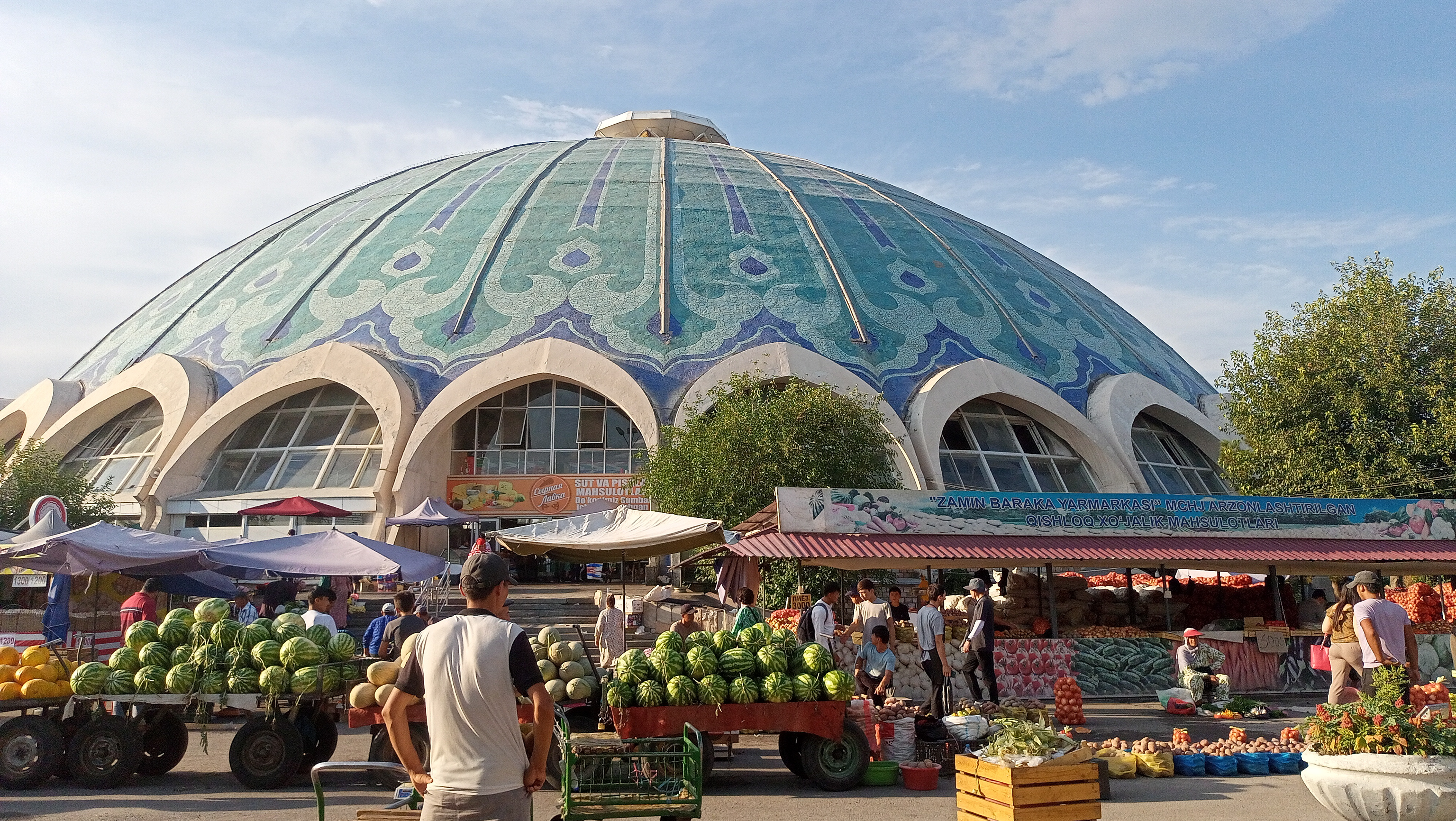
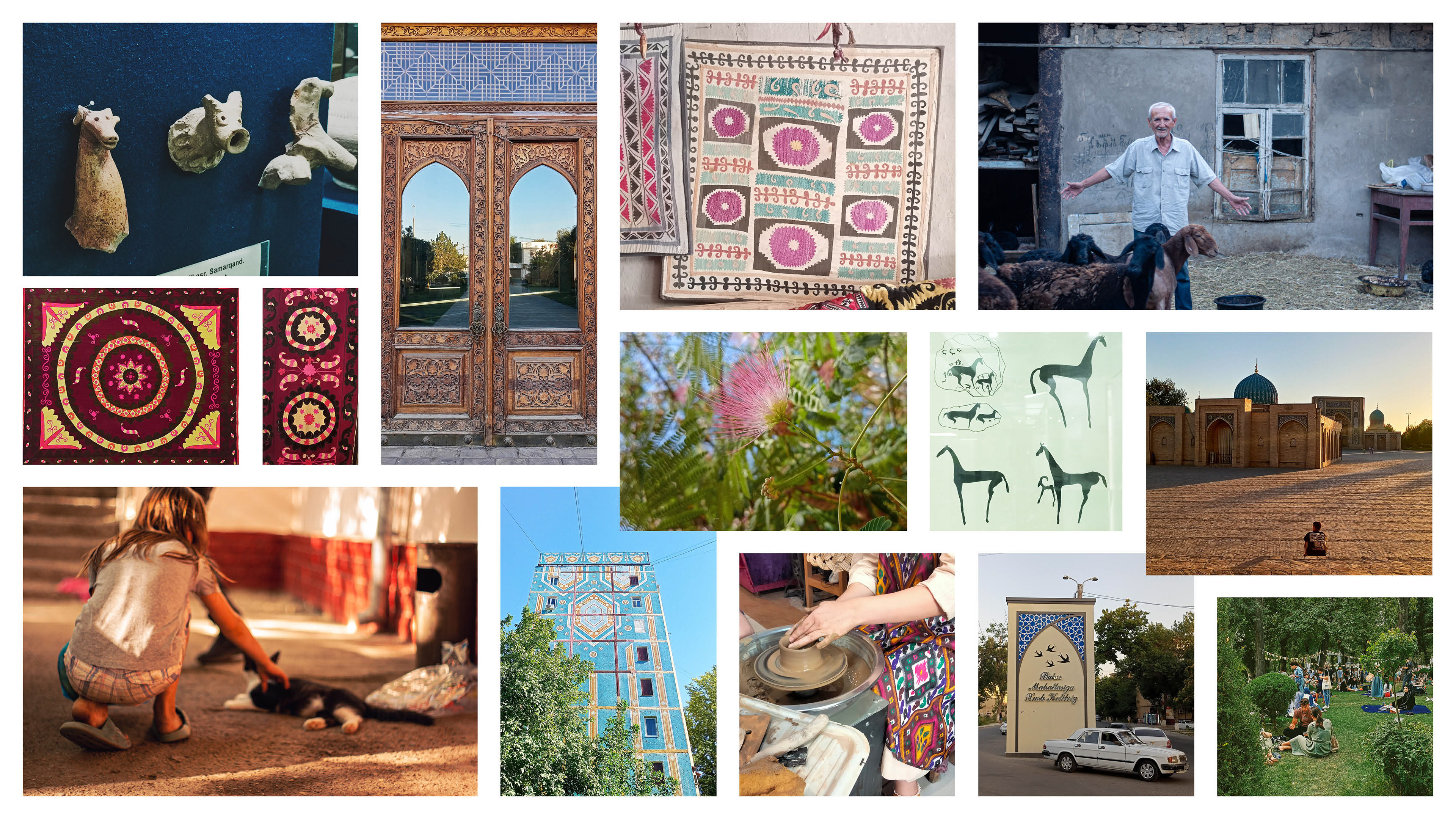
I recently heard a phrase that Tashkent is as diverse as a carpet, and that's its charm. Indeed, even if we look at the history of Uzbekistan in a museum, there's so much variety: traces of Greece, China, Russia, incredible ancient drawings, sculptures, fabrics; on the streets, you can observe several epochs simultaneously, and it's wildly interesting. It seems to me that even locals could endlessly explore all of this. I've decided that this diversity should be reflected in the branding of New Tashkent
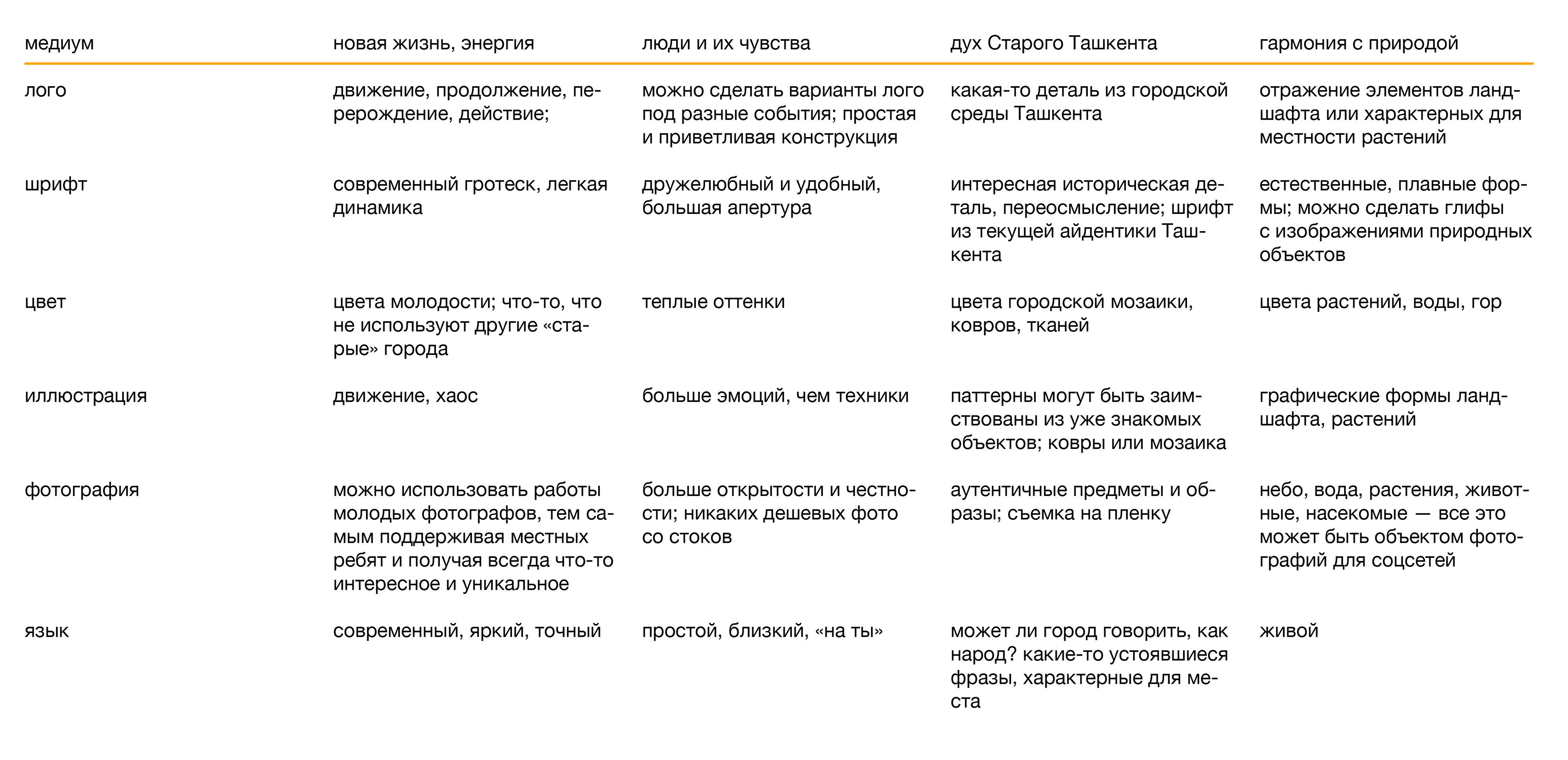
After the preparatory phase, I create a table that helps me generate ideas while adhering to the chosen direction. Some of these ideas later form the basis of the branding
Since I have already seen options from other designers, I tried to avoid repetitions, and as a result, I arrived at these two symbols:

an archway door as a symbol of hospitality; as an entrance into the future; as something that can be opened

rub el Hizb; a flower as a symbol of youth, unity with nature
I wanted to find a grotesque font with such shapes for "g" and "a", and where the endings of strokes, wherever possible, were at an angle. The most balanced seemed to be National from Klim Type Foundry

The chosen graphic symbol in the logo

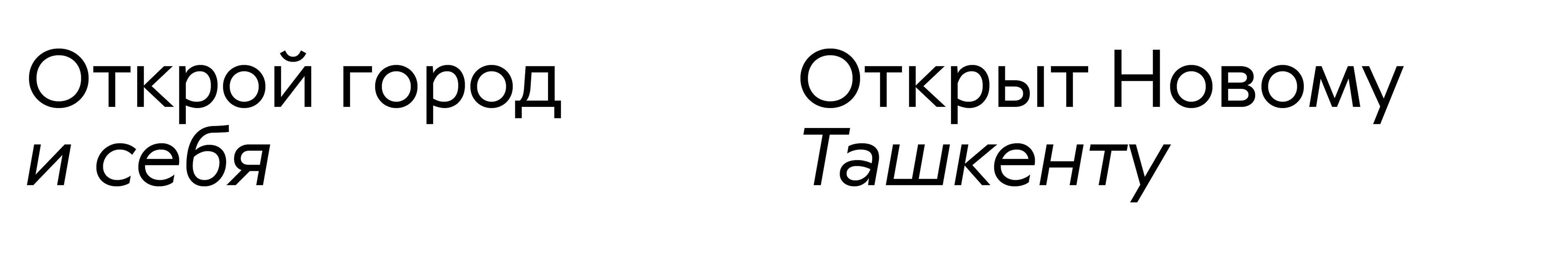
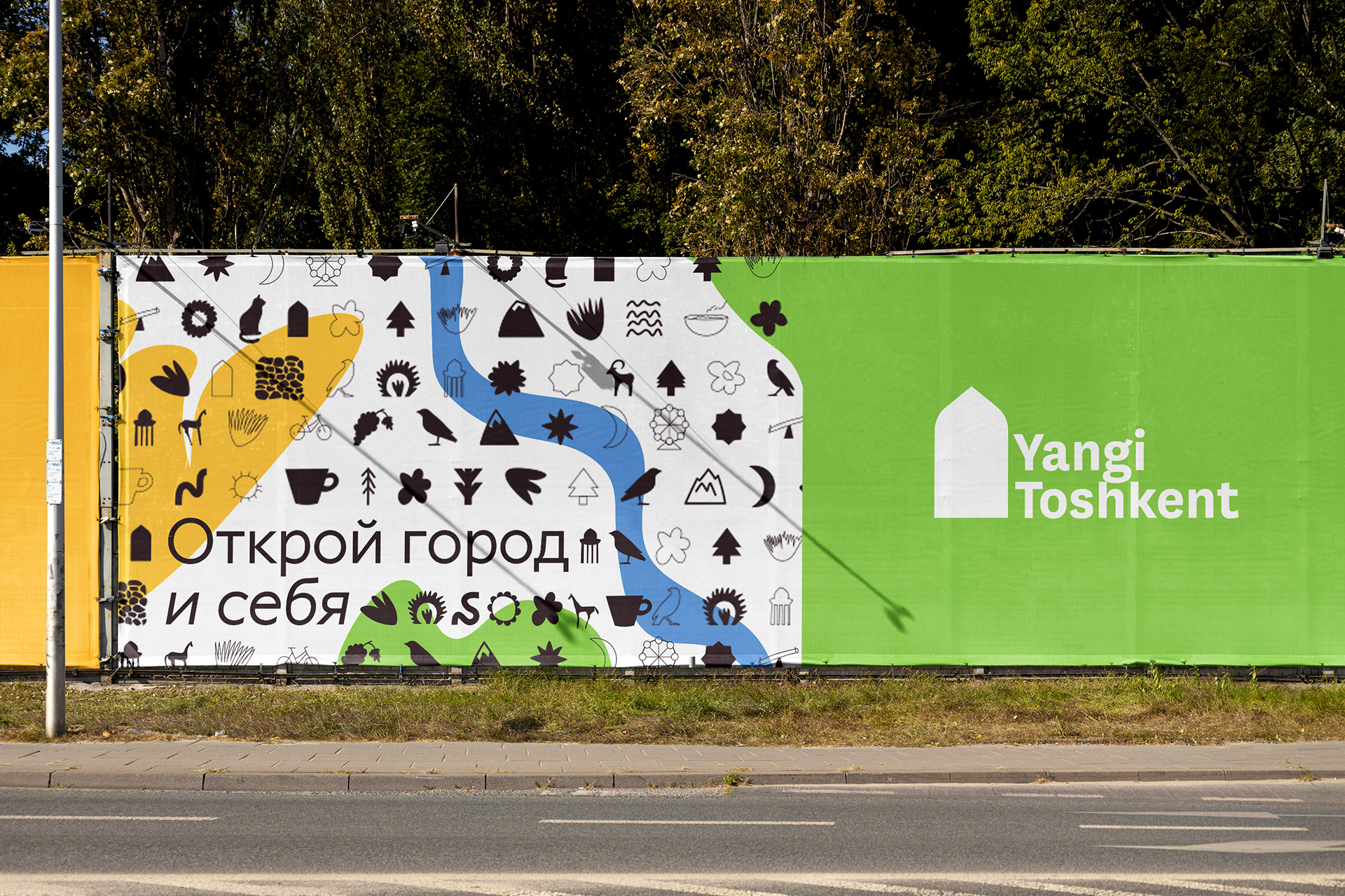
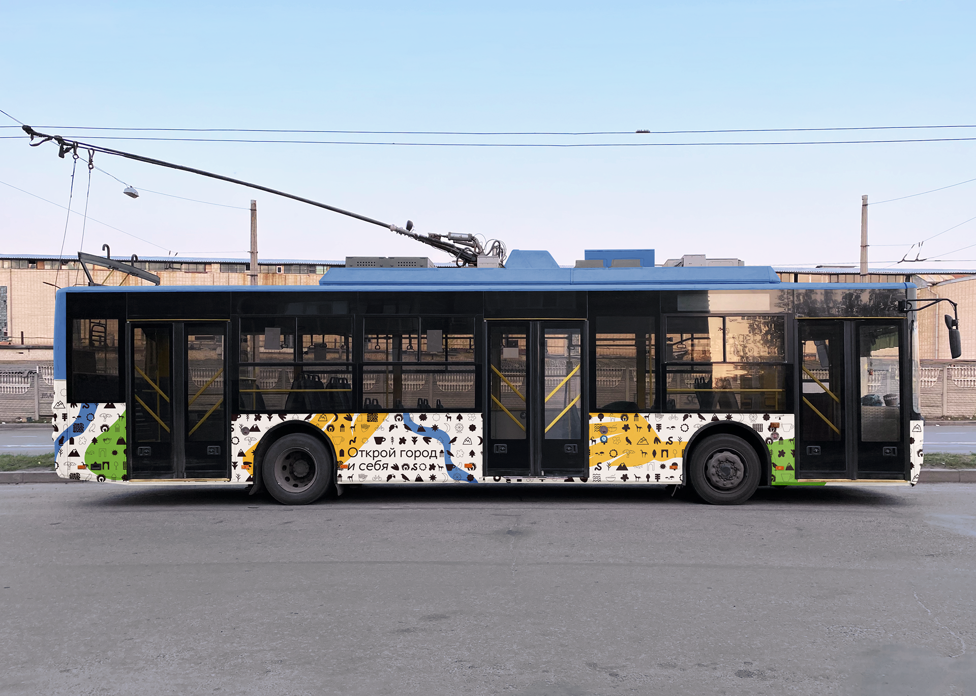
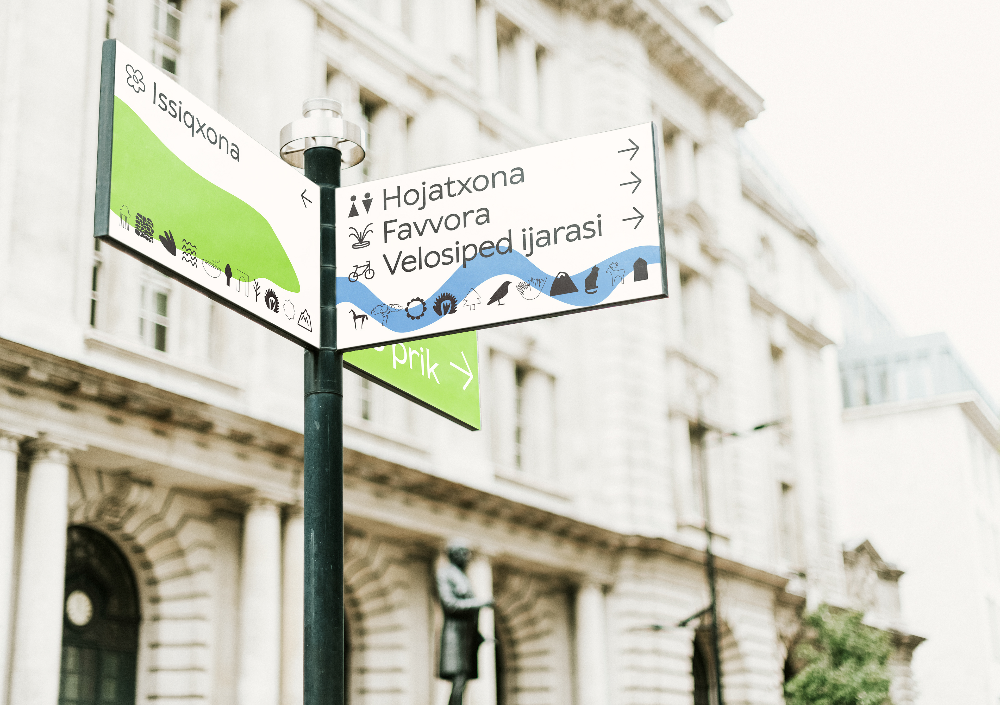
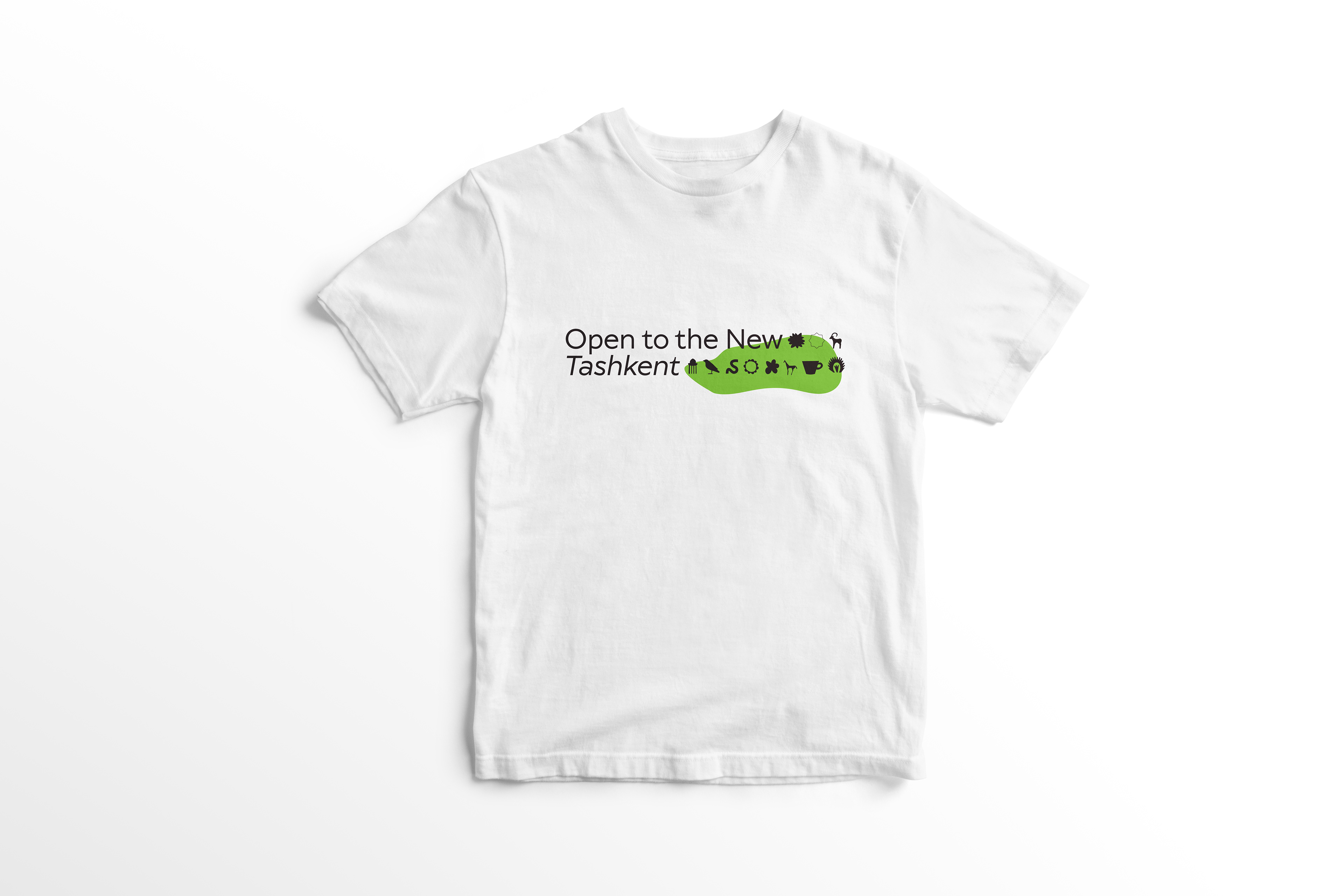
I decided to play on the theme of doors in communications to evoke a sense of dialogue and greater closeness with the city. Objects in the urban environment interact with residents, almost urging them to "open up" to discover the city and, in turn, discover themselves in this new city of vast opportunities. Both residents and guests can wear merchandise with the phrase "Open to New Tashkent" signifying their connection to Yangi Toshkent. Additionally, "Open the city and yourself" serves as a call for self-realization in this young and promising city. For the typeface, I've chosen Wellingtons in medium and medium italic from TypeType Foundry — it has a wide aperture and excellent Cyrillic support for potential communication in Russian
In graphics, I decided to reflect the theme of the diversity of Uzbekistan as a whole and Tashkent in particular by blending everything I found possible. I created icons in different styles: thin outlines, thick ones, filled and unfilled, smooth and angular, natural and urban. These icons can be embedded as glyphs in a typeface or even create a complete dingbat font, filling the space with symbols, literally creating typographic carpets. Moreover, it's possible to design icons for different events or themes and use fonts from them on occasion.

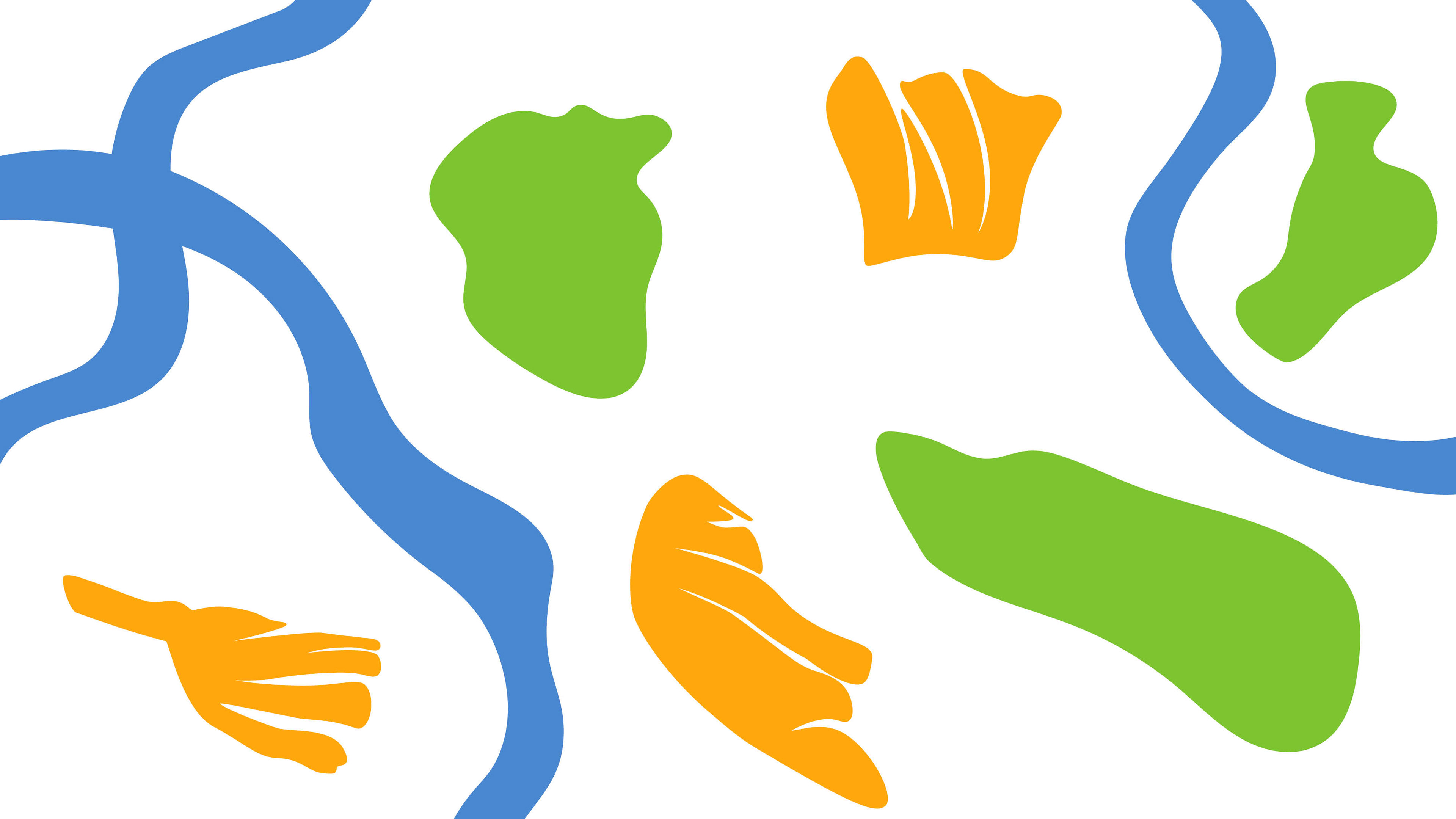
As bright spots for the background, I decided to use the landscape of nature in Tashkent and the surrounding region
Mediums


To order a visual identity design or discuss any other project, contact me on telegram